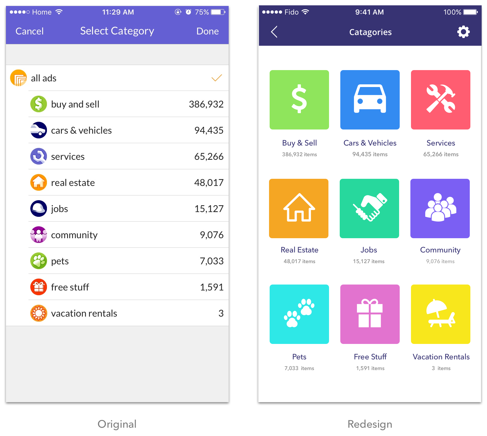
• Sepi Fallahian | UX/UI Designer
  • Works
  • About
  •  
  • Works
  • About

kijiji Mobile App Redesign

Developed in collaboration with Kamal Shalita.


We were provided with a design challenge to pick an existing app or website and do a heuristic evaluation to identify any UI problems. We chose to focus on Canada's largest and most popular classified app "kijiji"; a content heavy platform with million of visitors every day looking for goods and services.
Through time, the number of goods and services being advertised has overcrowded and saturated this advertising platform. The result is a confusing categorization of items which makes searching difficult. Our solution was to creat a more efficient search process experience for the usres by providing them a customer friendly interface to minimize their frustration and wasted efforts in performing a search.

Our Findings

Main Screen

  • Too many navigation points for the user make it confusing as to where they should start their search.
  • "Adds Nearby" section seems disturbing. It is too big and inconsistent compared to other items in the screen. Image placemnet in this section doesn't indicate that scrolling horizontally will show more nearby ads.
  • The "Settings" button location is not accessible. It is is located at the end of the scrolled page.
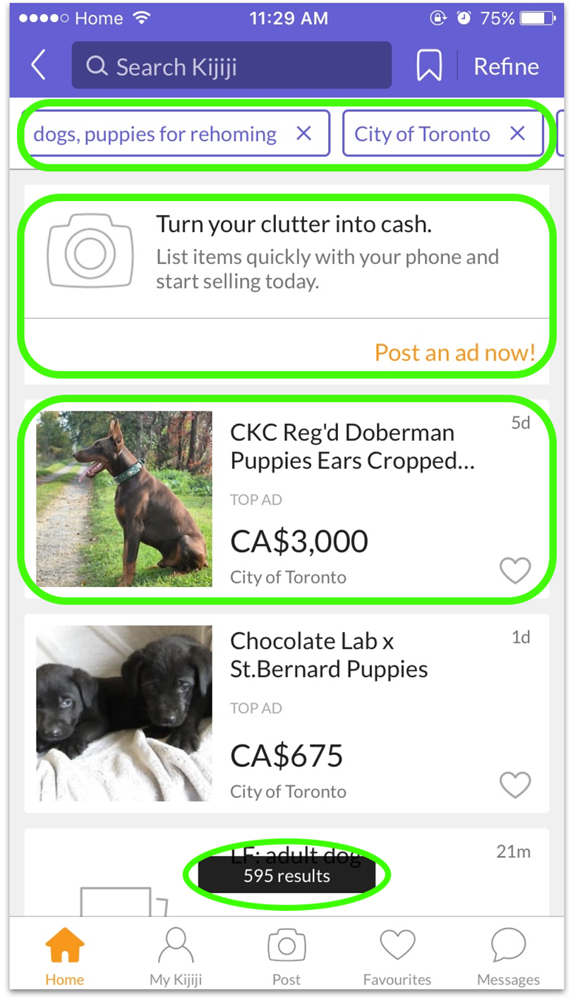
  • Having two "Post an add" button, one in the middle of the screen and one in the bottom navigation bar is unnecessary and makes the screen more cluttered.
  • “Brows Categories” button is too close to “Ads Nearby” section which makes is it less prominent and eye catching.

Categories Screen

  • Use of "list style" makes the categories titles less legible and more time consuming for the users to choose among them.
  • List titels begins in lowercase which makes it hard for the users to choose their desired catagory.
  • The numbers on the right, in front of each category does not indicate what do they stand for and represent.
  • "Done" button in the top navigation bar is unnecessary.

Sub-categories Screen

  • The list is not in alphabetical order. This forces users to read line by line until they find the item they need.
  • List items begins with a lowercase letter which makes it difficult to search items.
  • "Done" button in the top navigation bar is unnecessary.
  • The numbers in front of each subcatagory does not indicate what do they stand for and represent. These Number value does not have much relevance yet to the search process.

Search Result Screen

  • Filter tags on top of the search results section are confusing and make the page cluttered.
  • Having a big section for posting an ad on top of the screen is unnecessary becuase there is a "post your ad icon" in the bottom navigation bar which exactly dose the same action.
  • Lack of enough white space and not emphasizing on hierarchy through different font sizes and colors prevents user to see and compare products specifications and prices fast and efficient. This is very confusing and forces users to switch back and forth between products
  • Search result number at the bottom of the screen covers parts of search result screen. This Forces user to scroll to see the rest of search results.

OUR REDESIGN CONCEPT

Main Screen

Categories Screen

Sub-categories Screen

Search Result Screen

  • Works
  • About

Copyright © 2017 SEPIDEH FALLAHIAN